Friday, 12 December 2014
Thursday, 11 December 2014
Third Edit of Front Cover
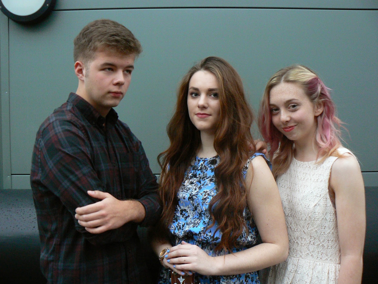
In my third version of my magazine front cover I changed the overall background to black. I cut out the main image and then added a black square to the background. I ensured that the main title was a full white block cut off with a red line to make it stand out from the other colours used on the cover. I overlapped the top of the girls head at the top (the one standing in a white dress) putting it over the top of the red dot to ensure the main image was the focus of the cover. I did this by cutting out the top of her head that was under the dot and copying it into a new layer and overlapping the red dot with it. I made sure it was blended into the hair on the main image so it looked natural and like it hadn't been cut out. I used the feather tool to do this so it was blended and not harsh lines.
Tuesday, 9 December 2014
How I did my front cover
I used a website called bandnamemaker.com to get ideas for the name of my band the front cover of my magazine. This means that the band would look more real and original.
Friday, 28 November 2014
Thursday, 27 November 2014
Thursday, 13 November 2014
Google Mock Up
I decided to use the band 'The Lumineers' for my google mock up front cover. This was because my market research showed that people preferred bands to solo artists.
I decided to use this shot of the band because it showed all of them clearly and with their full bodies. I think that this picture sums up the genre well with the use of clothing and props. I decided to do a black and white version and a colour version to signify the difference a subtle change can make.

This is the process of making my google mock up:
I stared my putting my chosen image into a photoshop document. I then added my masthead which I put together in a power point, using texts from dafonts.com. The slanted main feature story was also put together on a power point document, using the writing from dafonts.com. I used the same fonts throughout the front cover top ensure continuity. Adding the other feature stories to the side of the cover was also using the two fonts used throughout.
I added the red dot and the red band at the top to add some colour to the cover as it was fairly bland as it was and needed to be eye-catching.
My final mock up were the same apart from using a coloured image and a black and white version. I added the coloured posters to make the cover more full and to add more colour. It is also added promotion and therefore will draw in an audience.
Subscribe to:
Comments (Atom)


